The project involved transforming and enhancing the landing page for a website specializing in distressed property information. The original page was visually unappealing, suffered from low user interaction, and required an update to accurately represent the high-quality data and services provided.
In the overhaul of the distressed property information website, the main issue was its antiquated design that was affecting user interaction negatively. My objective was to update the website with a contemporary, visually appealing, and easy-to-navigate interface that would appeal to users and foster trust in the platform. Furthermore, I employed user journey mapping to identify key points of interaction within the site. This method helped me discover opportunities for the website to offer vital information and improve the overall experience, making the process of finding and assessing distressed properties efficient and user-friendly.
In redesigning the content layout for the distressed property information website, I utilized wireframing to systematically structure the content into well-defined sections.
This approach was primarily aimed at addressing two main objectives: firstly, to align with business goals, which include encouraging users to engage with fundamental features such as browsing distressed property listings, utilizing valuation tools, and accessing investment guidance; and secondly, to meet user expectations by providing comprehensive and clear information on property details, condition, and investment potential, as well as advice on navigating the purchase process, thus improving their overall experience on the site.

For the redesign of the Source for Distressed Property Information website, I chose the Cairo typeface for all textual content, aligning with its status as the brand’s typography. This decision supports the site’s mission to provide in-depth and authoritative information on distressed properties. Cairo, characterized by its modern and clear-cut style, ensures that both headers and body text are readable and visually appealing, allowing key sections and services to be prominently displayed. The exclusive use of Cairo, as the brand’s chosen typography, creates a unified and elegant design aesthetic, reinforcing the website’s identity as a trusted and professional destination in the distressed property market.

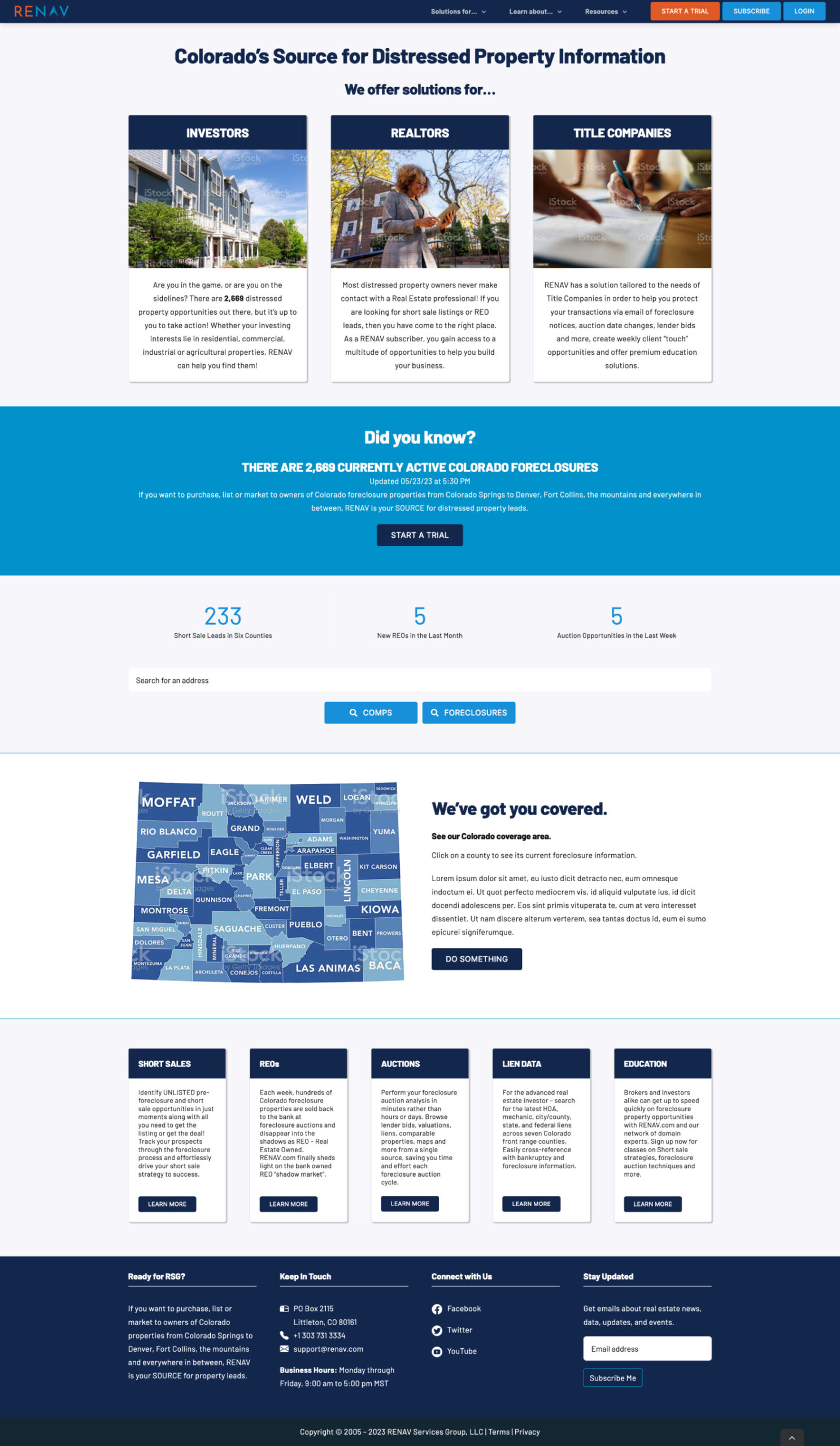
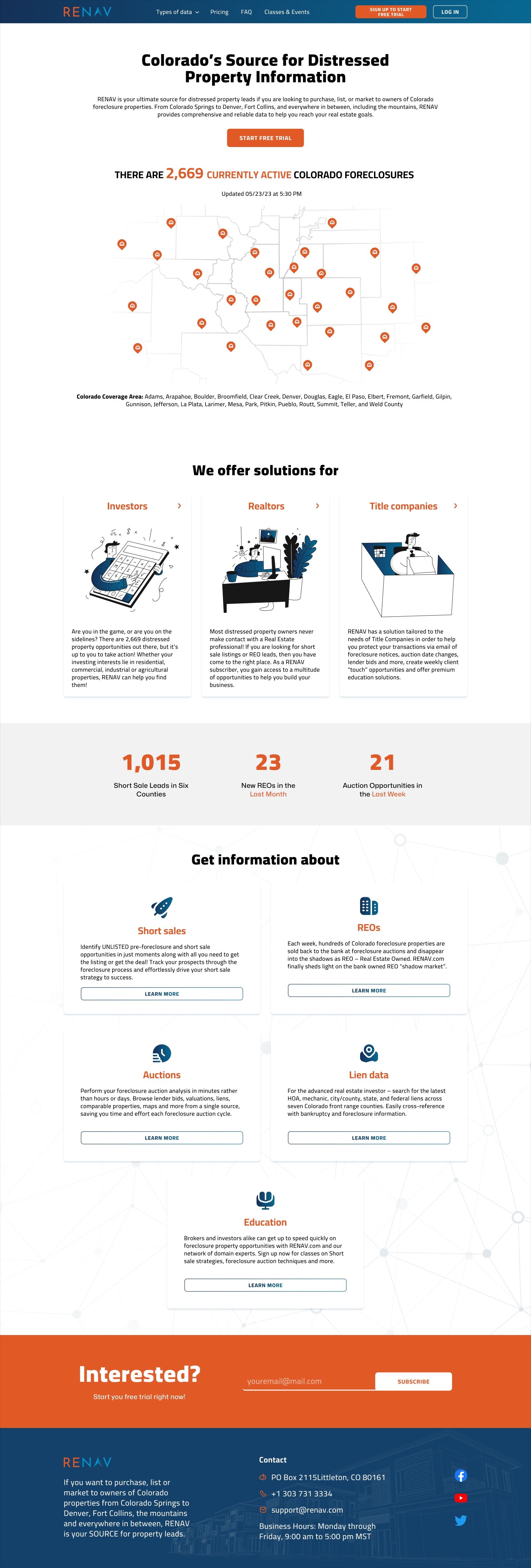
Here are the final designs for the webpages, after applying the visual identity.
Positive Feedback: After the launch, the landing page of Colorado’s Source for Distressed Property Information website received favorable feedback from users, indicating a boost in both engagement and user satisfaction.
Next Steps: Going forward, the emphasis will be on consistently analyzing website analytics, soliciting ongoing user feedback, and applying regular updates and improvements. These initiatives will be informed by changing user needs and the latest trends in the real estate market, particularly in the distressed property sector, ensuring the website remains a valuable and relevant resource.
The Website Design project for the Source for Distressed Property Information effectively updated their online platform, turning it into a clean and accessible interface. This overhaul improved the site’s visual appeal and concentrated on boosting user engagement and satisfaction. By meticulously combining design elements with user-focused principles, the project created an online environment that not only highlights the potential of distressed properties but also aligns with the site’s business objectives and meets the refined needs of its audience.
![]()
![]()
![]()
![]()