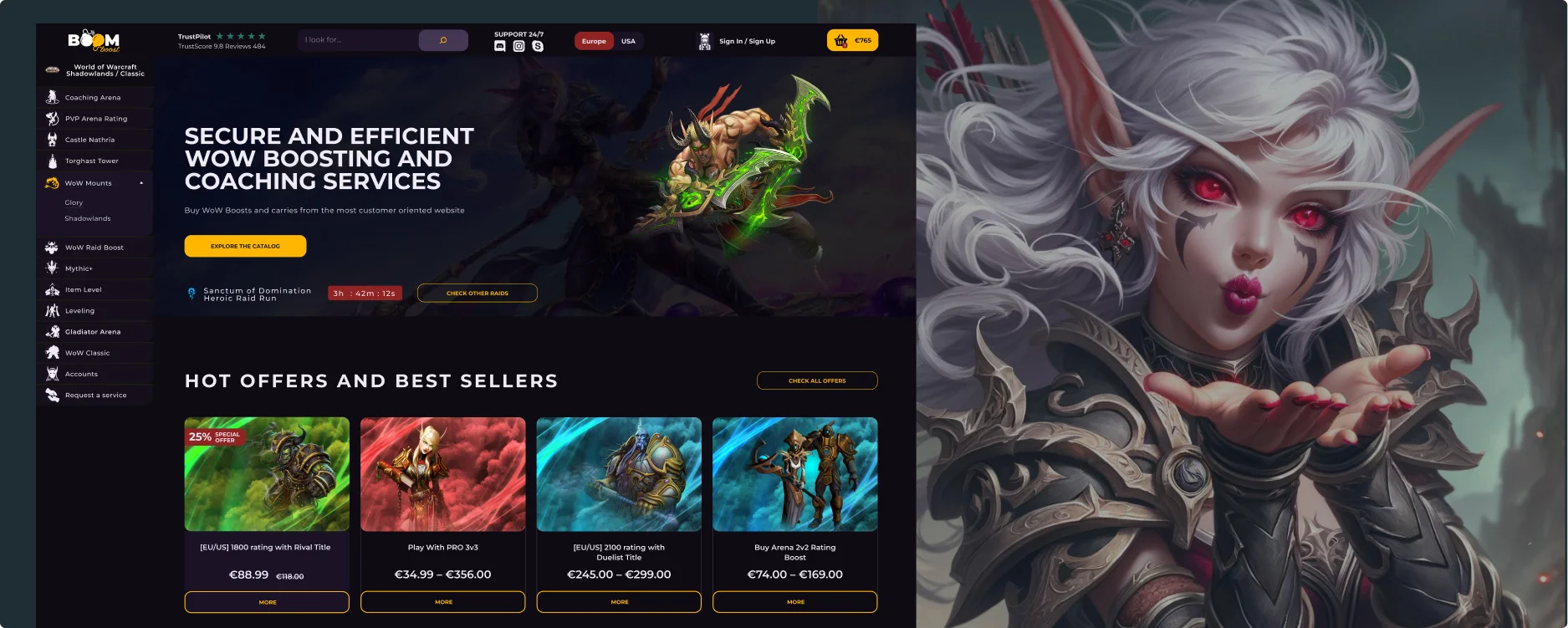
The assignment centered around refreshing and updating the World of Warcraft boosting services website. The key goal was to enhance the site’s aesthetic and user interaction to more effectively highlight the range of boosting services available. The prior site had limitations in engaging users and didn’t fully convey the excitement and expertise of the gaming services offered. The overhaul aimed to produce an engaging and seamless navigation experience that matched the dynamic and professional nature of the services and the expectations of the gaming community.
In the revamp of the World of Warcraft services website, I faced the task of transforming an antiquated interface into a contemporary and interactive user hub. My objective was to infuse the site with a fresh, appealing look that spoke to gamers and instilled confidence in the boosting services offered. To achieve this, I meticulously mapped out the user journey, pinpointing pivotal touchpoints where strategic information could be positioned to streamline the purchasing process. This approach was aimed at crafting a seamless and engaging experience for players seeking to enhance their gaming prowess through professional boosting services.
In developing the revamped content architecture for the e-commerce boosting website’s website, I embarked on wireframing to methodically structure the content into clear, distinct sections.
The foremost aim here was to lay out the information in a way that serves dual purposes: firstly, to align with business objectives, which involves motivating users to interact with key features like product optimization tools and analytics dashboards; and secondly, to fulfill user goals by offering clear insights into how the website’s tools and services can enhance their e-commerce performance.

For the World of Warcraft boosting services website design, I chose the Montserrat typeface from the Google Fonts collection for both headers and regular text. This choice aligns with the dynamic and contemporary vibe of the gaming environment. Montserrat, with its clean and geometric sans-serif style, embodies the modern and digital nature of the game. Its versatility allows for clear legibility in both headers and body text, ensuring that information about the boosting services is easily accessible and engaging. The typeface’s sleek and uncluttered appearance complements the high-energy, action-packed world of Warcraft, enhancing the website’s overall appeal to the gaming community.

Here are the final designs for the webpages, after applying the visual identity.
Following the launch of our revamped website for World of Warcraft boosting services, we’ve received overwhelmingly positive responses from our users. They’ve appreciated the enhanced user experience and the engaging design elements. Going forward, we’re committed to regularly analyzing user data and feedback. This will be our compass for making continuous improvements, adapting to changing user preferences, and staying ahead in the competitive gaming services industry. Our goal is to ensure our platform remains a preferred choice for gamers, reflecting the latest trends and user expectations in the world of online gaming services.
The website redesign for Boomboost, the World of Warcraft boosting services company, transformed their online presence into a dynamic and engaging interface. This overhaul significantly improved the visual appeal and user experience, making it more inviting and easy to navigate. The design successfully combined elements that resonate with gamers, emphasizing the exciting and adventurous nature of the services offered. The result is a more interactive and compelling platform that not only aligns with the gaming community’s expectations but also effectively supports the business’s objectives in the competitive online gaming market.

