
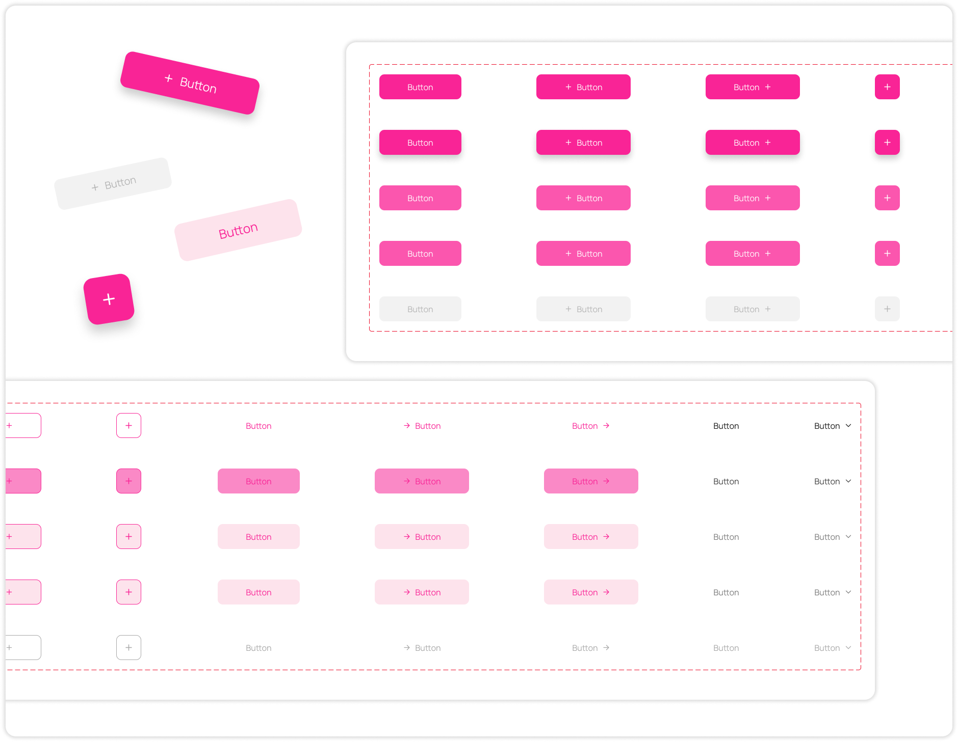
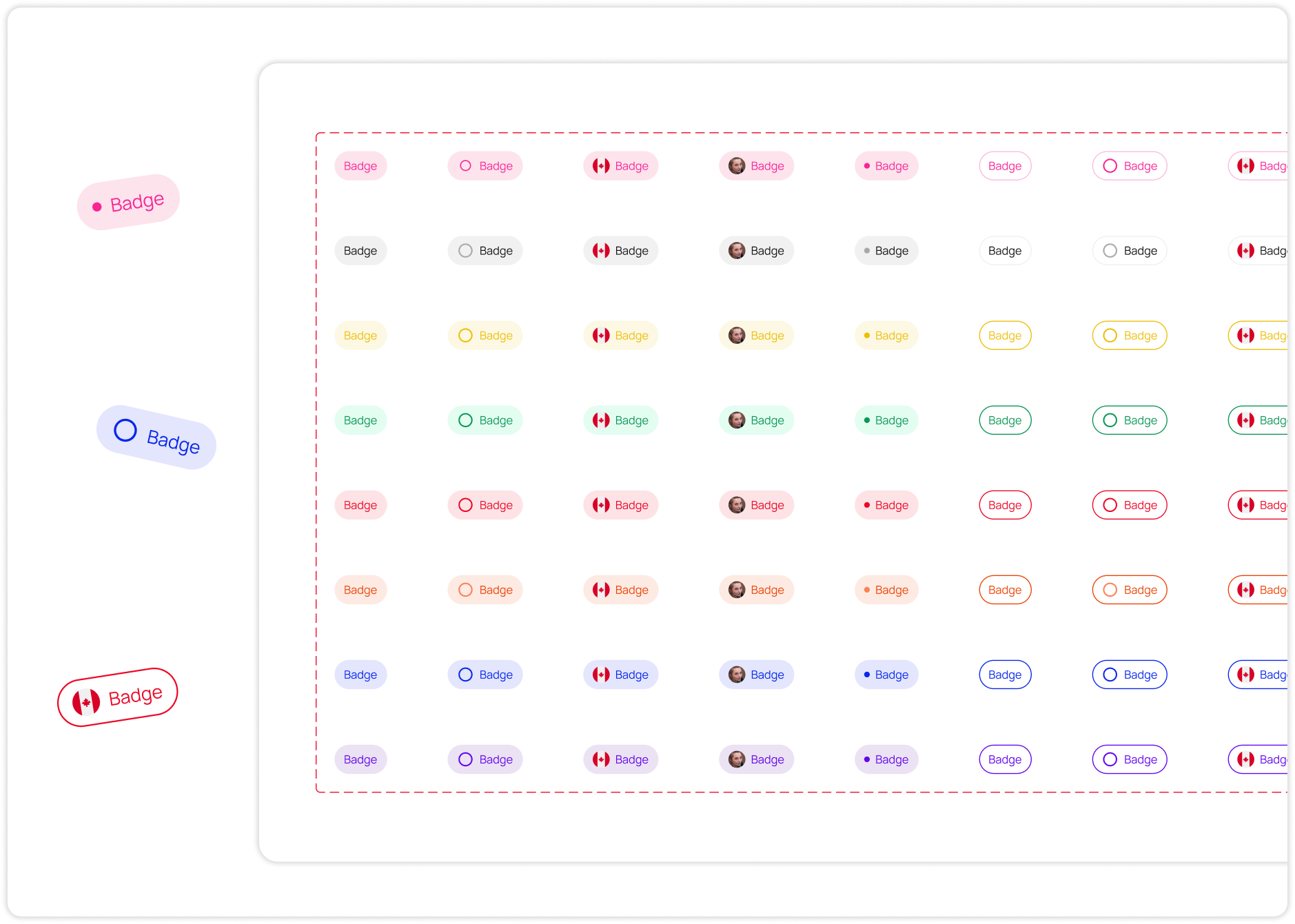
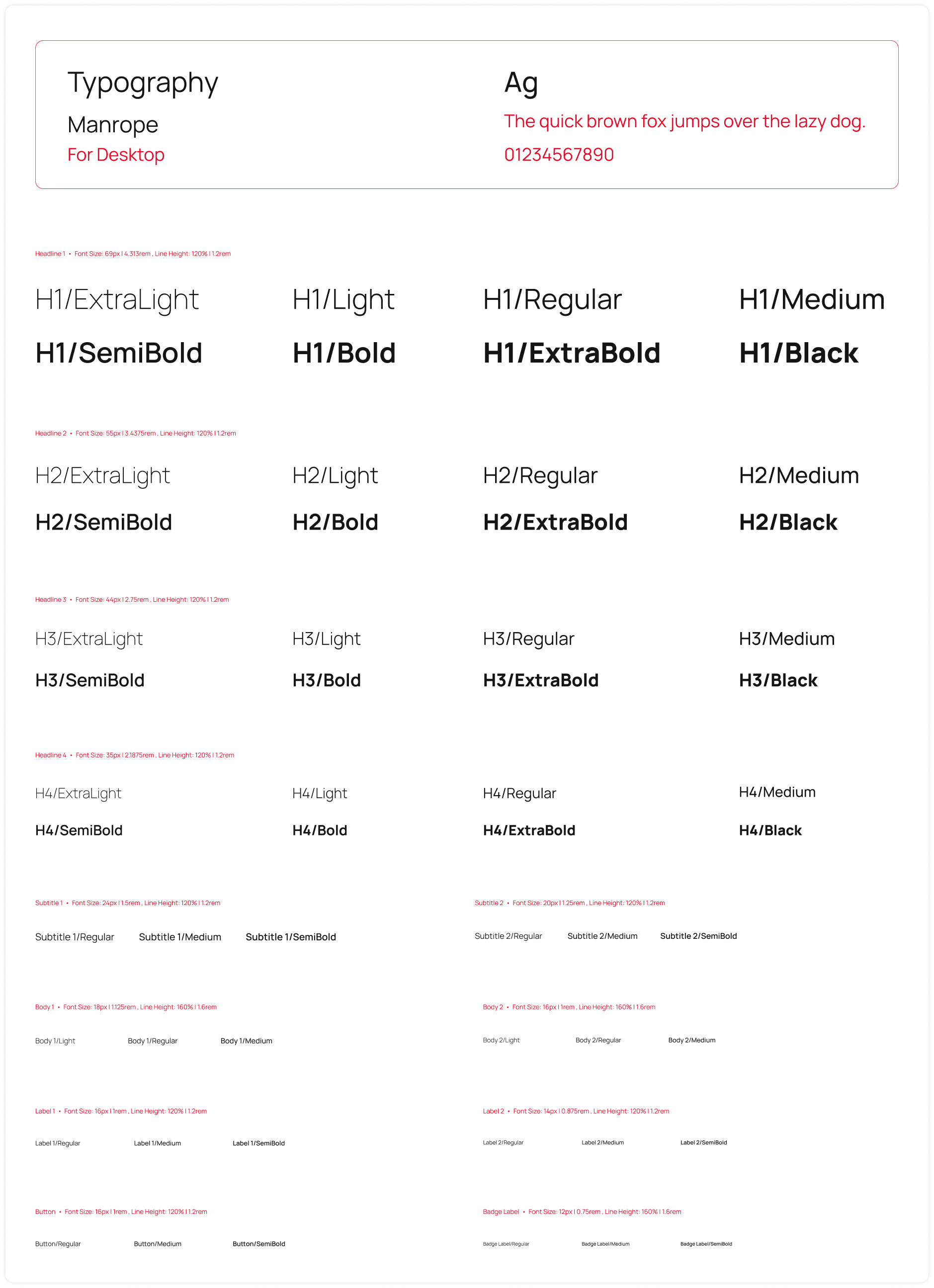
With each new project or phase, I found myself beginning from the scratch, necessitating the establishment of a fresh components library each time. Consequently, I consistently found myself redesigning identical components, with their style varying each time to accommodate different functionalities.


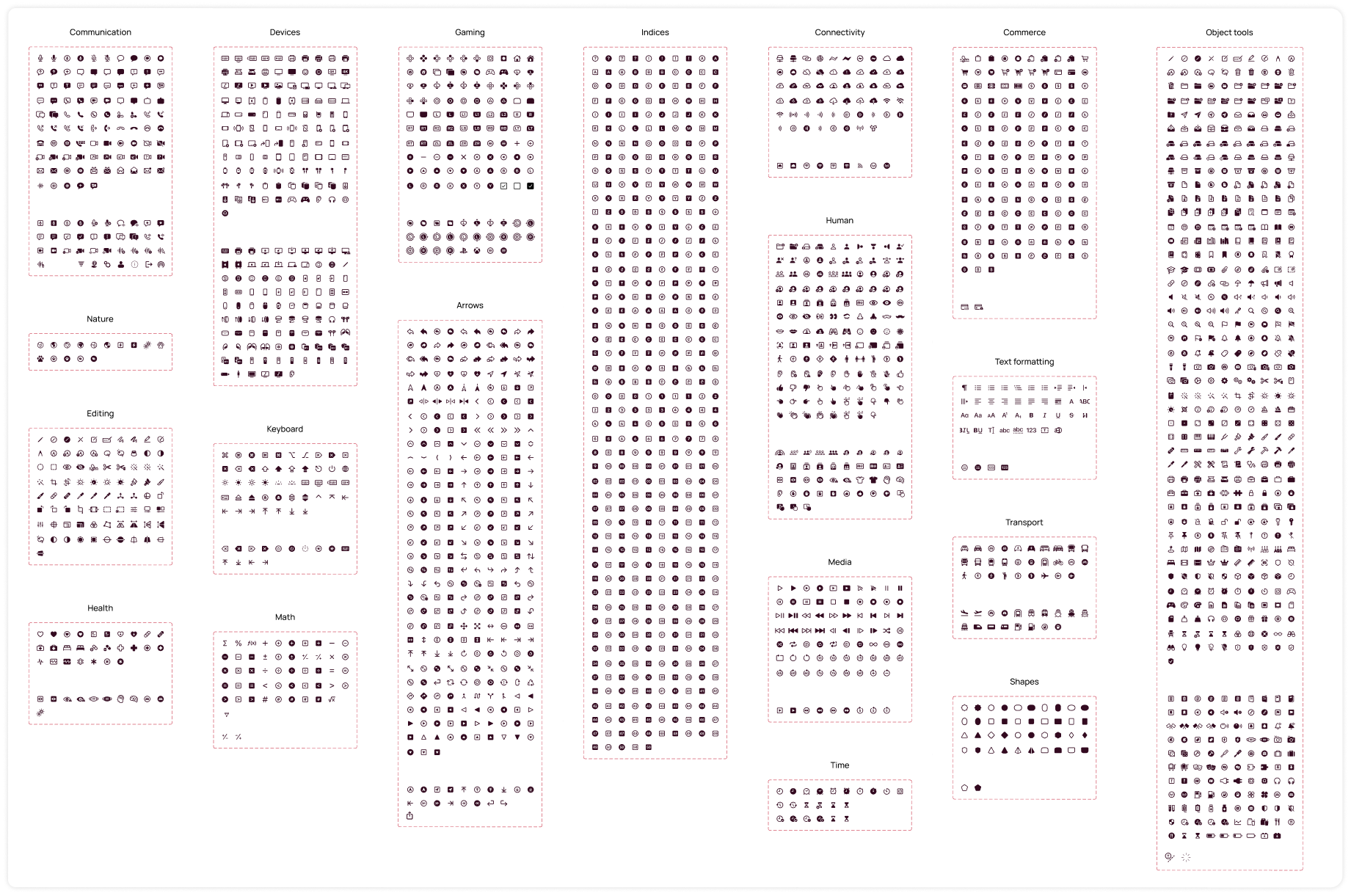
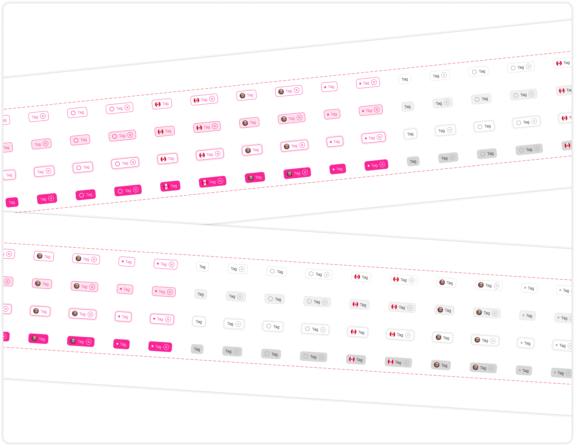
 Swipe to see more
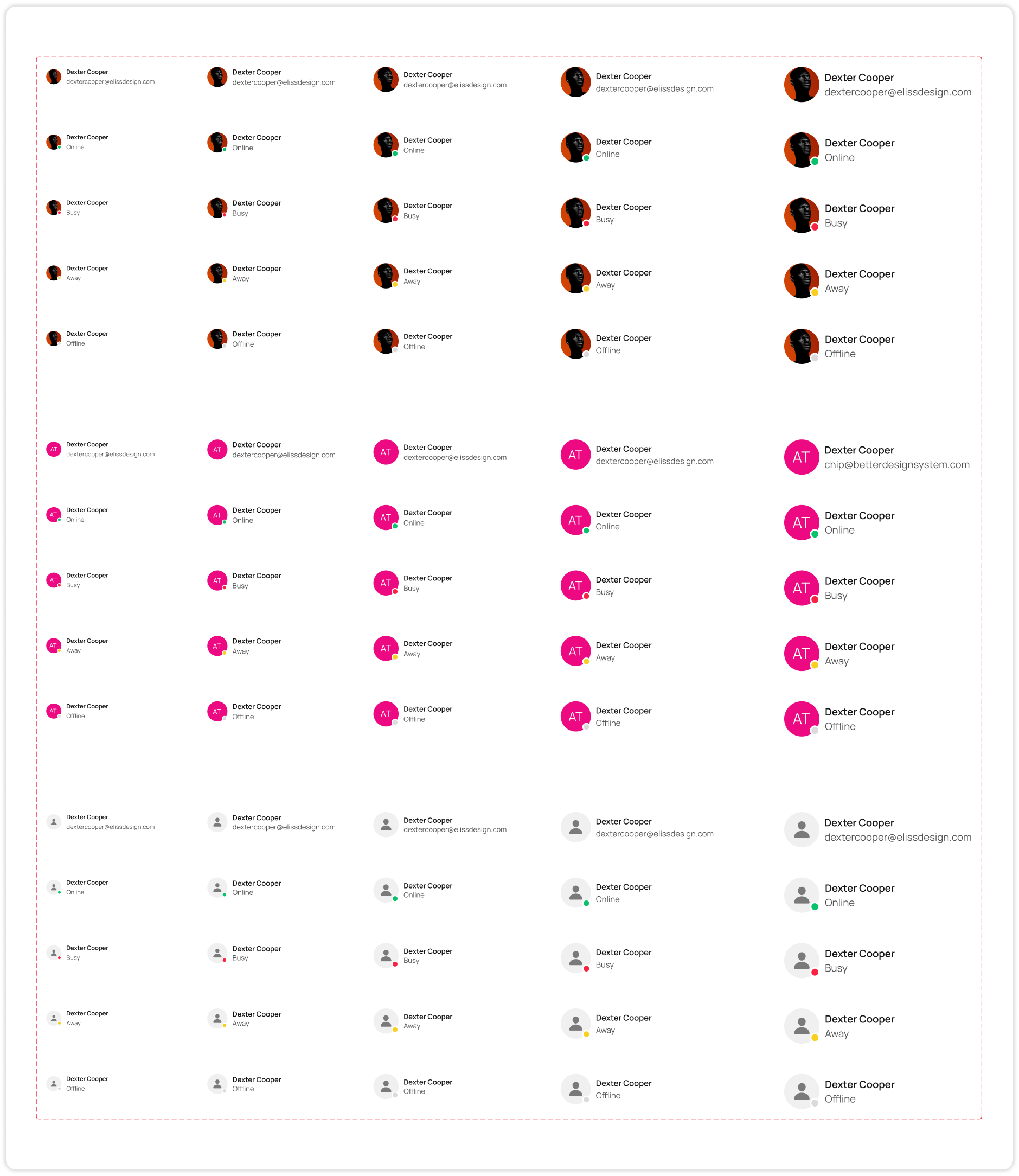
 Portfolio
  Skills
  Resume
  Blog
Blog 