Any, even the simplest game has an interface. It can be minimalistic, abstract, harmoniously fit into the design of the environment as a whole, or represented by a traditional HUD with a health bar and the number of remaining cartridges in the clip. Whatever it is, every interface is designed to serve primarily the same purpose: to clearly and quickly convey some information to the player.
In this article, I will try to understand the essence of such a phenomenon as the user interface in games and consider its significance in any quality project.
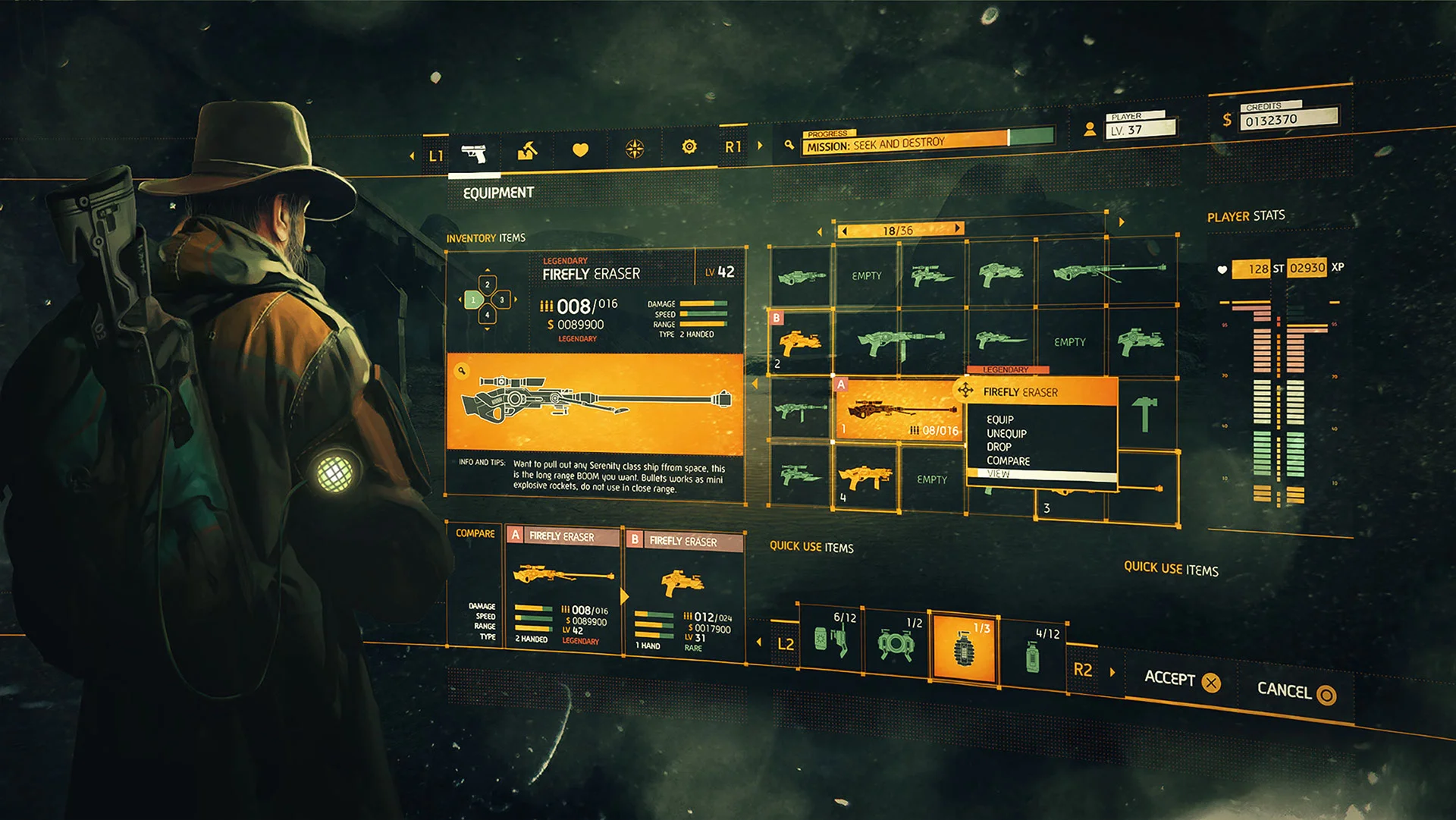
Even outside the gaming industry, design plays a huge role in human life: most of the information we receive from the environment through visual perception and attractive design, harmoniously matched colors, and matching shapes can contribute to the overall quality of life.
Moreover, in a world where information flows much faster than before, many ways have been invented to reduce the amount of information: when you hear the notification sound of an incoming message, you see a drop-down box with text or red light that appears on a browser tab, you are already working with a user interface. Instead of reading a lengthy notification about receiving a message on such and such a date from another user, you already know right away that a friend from the college wrote to you about tomorrow’s lab.
The interface works in the same way in video games: by using a system of visual, audio and sometimes even tactile components and signals, the game conveys some information to the player and improves the gameplay and overall experience of the game.
Thus, the user interface (UI) is a complex of elements that serves as a link between the user (player) and the program (game).
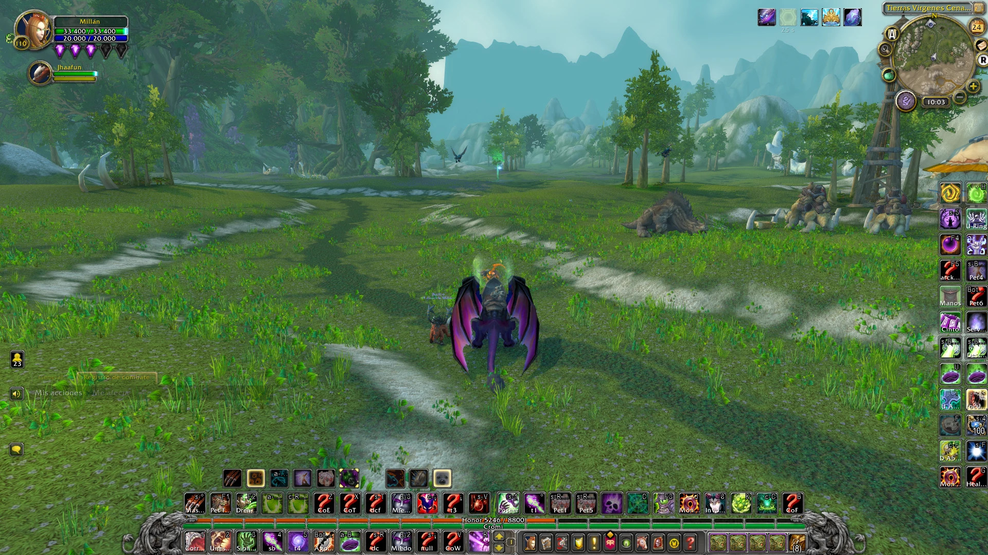
The quality of the interface is determined by many parameters: color palette, screen layout, art direction, and much more. As the main form of communication between the game and the player, the UI is very important.
There are several main commonalities that can usually be observed in successful projects:
Practicality and accessibility: The UI may look different, but with its help, the developer must be able to convey important information to the player. If this condition is not met, such an interface can greatly spoil the impression of the game: it is better to once again use a boring but understandable red bar than to experiment, displaying the state of health, for example, by the color of the crystal in the hero’s bracer, because you can simply not change its shade notice in the heat of battle or in non-standard lighting. In the same way, the best interface is one that will be intuitive to a person who has never played games: a health reserve, for example, is logical to mark with a heart. Infographics work here because it corresponds to the expectations already established in the industry and the semantic meaning – how many injuries a character can suffer before dying, but if instead of the usual icon there is a star or pen icon, this can already be misleading. In addition, a good interface should be easy to read, regardless of the conditions and what is happening on the game screen: the most key parameters are displayed so that the player can read information with one brief glance, for example, to find out the number of cartridges left in the weapon magazine or the satiety indicator.
Relevance: The task of the designer is to develop an interface that will not be intrusive and at the same time conveys all the necessary information. In the gaming industry, there are examples of different approaches to this task, both successful and not very successful. It is important to strike a balance between informativeness and relevance, so as not to overload the player with unnecessary data, but to convey to him everything that is important directly within your game. If you still consider it necessary, let’s say, to display the time on the interface screen, instead of a large clock, you can use two-digit numerical values or even two numbers with a couple of letters that reflect the time of day.
Continuity: Although the above may disappoint or make you think that you should use only one narrow range of possible interface options, this is far from the case: even within the same genre, there are examples of different approaches to UI design. If the interface itself is made competently and efficiently, albeit unusually, it will rather be an advantage and there is no need to be afraid to experiment. It was about the fact that stable unified elements and principles have developed in the industry over the past years so that the player does not need to learn to read exactly your unique UI every time: for example, a mini-map can either be a detailed level model, or a schematic and a generalized image, or in general – be replaced by a more compact compass, but in all three cases it performs its function of helping the player navigate in the game space. The same is true for indicators of status effects, such as stun or poison in MMORPG games, or characteristic blood splashes on the screen in shooters, indicating that a character has been injured.
The quality of the interface is determined by many parameters: color palette, screen layout, art direction, and much more. As the main form of communication between the game and the player, the UI is very important.
There are several main commonalities that can usually be observed in successful projects:
If you look at the design of a few randomly selected games, you can also see patterns and similarities: for the most part, HUD components are located at the edges of the screen, although some information, on the contrary, is concentrated in the center. The menu, on the other hand, when opened, does not always cover the entire screen and may leave some space free, or the window size changes, shifts or collapses, opening up space for new tabs. All these little things have been developed from the development of many games of the past and are now used everywhere. The task of the UI designer is to find the most practical interface that will look harmonious in the overall composition and effectively communicate the necessary data to the player.
Now that you have a general idea of the interface and why it is so important, I would like to review the existing classification of UI. The theoretical base will not only help in the future in self-study of the issue, but will also allow you to look at existing projects from the point of view of game design, evaluate the quality of work of other developers and, possibly, find out which approach is closer to you and better for your project.
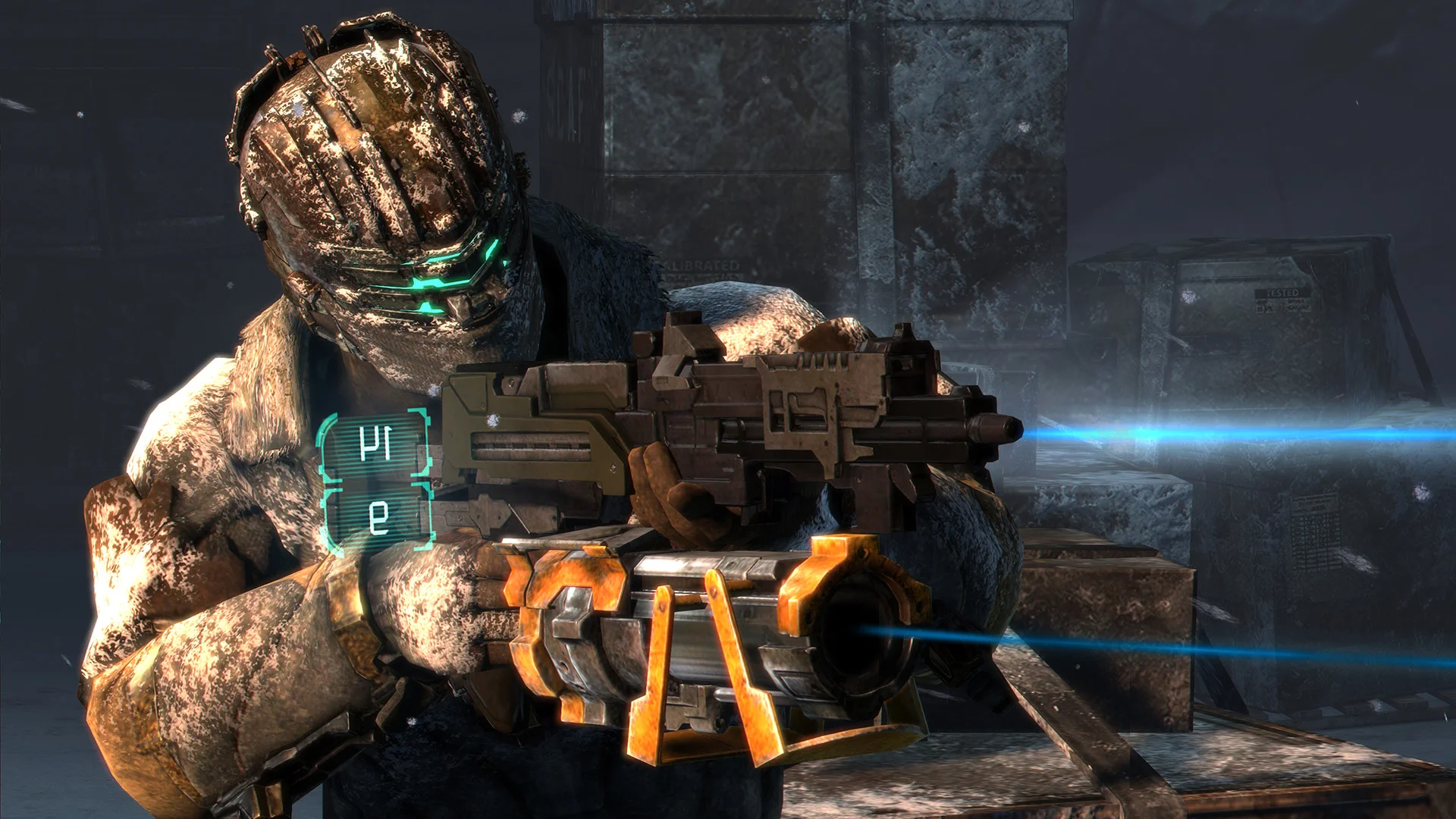
Diegetic: An interface type that has been popular for some time in the past and is integrated into the game space. The main and main advantages of such an interface are the ability to creatively approach the design of familiar HUD elements and menus, as well as increase the degree of immersion in the gameplay and the world: the ammo supply can be represented by a certain number of magazines on the belt, and the decrease in health is reflected in the form of bullet wounds or reddening cuts on the character’s body. The disadvantage, and the reason why this approach managed to lose its popularity, is that overly complex and non-standard forms of the interface and displaying even the basic parameters became not a “feature” of games, but an additional inconvenience in the gameplay, further complicating it for the user.
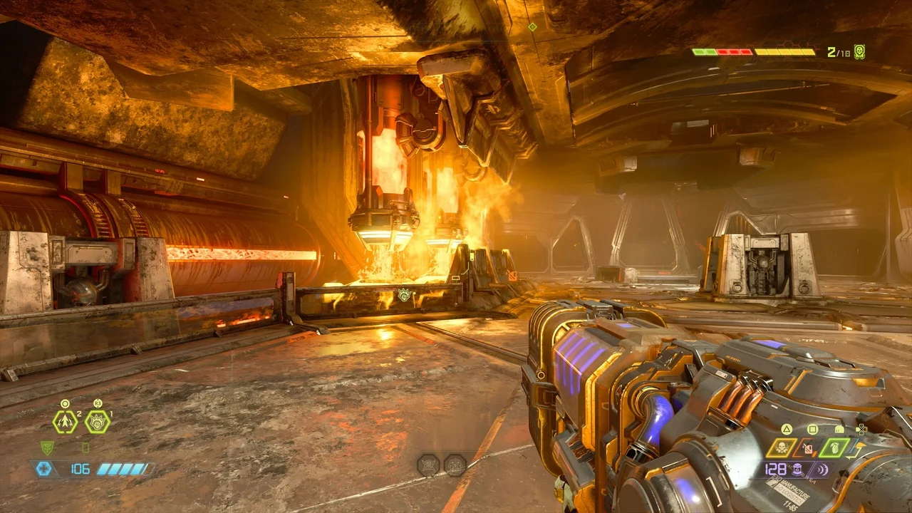
Non-diegetic: A more common and “traditional” interface design principle in which gameplay information is displayed on the player’s screen, but does not exist for the protagonist or the rest of the game world. It is easier to implement and the designer has much more examples to study and adapt. Such an interface, on the other hand, if done poorly, will be an eyesore and is unlikely to surprise anyone. Usually acts as a necessary convention that improves the quality of the gameplay.
Hybrid (or Spatial): A mixed variation that lies at the junction between the first two. An interface of this type implies the presence of interface elements directly in the game world, such as quest markers or highlighted opponents, but in the reality of the game world, they also remain insignificant and serve only the needs of the player. Such interface elements can break the immersion more, but a skilled designer can be able to use them not only for in-game purposes, but also to reinforce the established style of play: the quest marker in horror can be a wandering ghostly flame, and in the strategy of dividing the battlefield into cells or hexes eliminates difficult miscalculations;
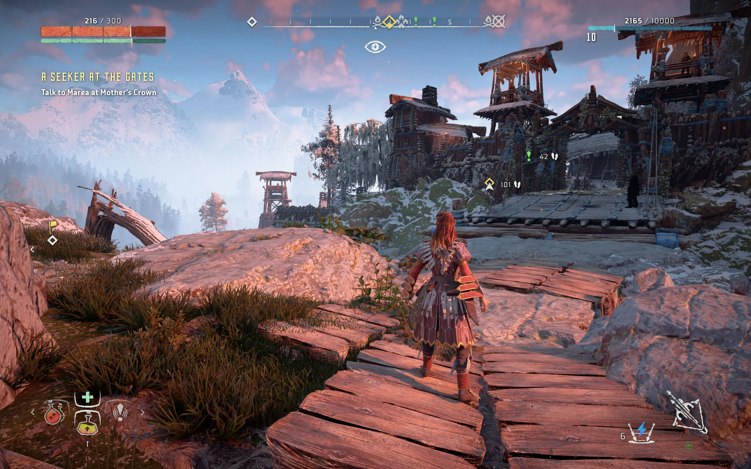
Meta-interface: The last type of interface, which is much more technical. This includes a camera that follows the player’s character and changes position depending on what is happening on the screen, or the sound of a heartbeat and blood splatter covering this very camera as a sign that the protagonist’s death is near.

In fact, there are few games that use only one approach. While a health meter might be appropriate in a classic RPG, in an atmospheric horror this UI element may be completely absent, and in a slasher title, it is displayed in the form of a red pulsing around the edges of the screen.
Surely at this stage, you can already guess, or maybe, remember your experience of the game, and answer the question with confidence: what kind of interface can really be called good?
There are a number of principles for creating UI, based not only on monitoring the success of individual game projects but also directly related to the principle of the human brain – an important factor. It is also worth noting that different cultures also approach design in different ways: Western and Eastern schools of design are strikingly different, not least because of the differences in requests and expectations of the player.
The last point in this article will no longer be a consideration of the basics of UI design theory, but the possible three styles of its implementation in practice: combining different approaches, playing with elements and placing them in different places, as well as working through the color palette and transitions between menus, you can achieve fantastic results. . When you think about how the game should look like, you can imagine a certain image that already fits into one of the categories, or combine different components as necessary. It is only important to remember that not only, in particular, individual elements must be of high quality, but the entire interface will be perceived as a whole. The more smoothly and harmoniously it is woven into the game, the more pleasant the experience of using it will be, and even if your HUD does not stand out from the rest but conveys information in an accessible way, it is much better than if it is lost, it is worth starting a shootout.
There can be three possible styles at the end of work on the UI:
Flat Design: A distinctive style for games set in more modern or futuristic settings. Dimming, translucency, and glow effects can override basic shapes, lines, and shapes. Examples: Fallout New Vegas, Death Stranding, Overwatch;
Stylized design: Often found in older games, as well as many projects on mobile devices. It is distinguished by bright, memorable, and detailed interface elements. This type of decoration is designed to recreate some theme or support a theme, for example, scarab beetles, sphinx heads, and two-dimensional images of people evoke the spirit of ancient Egypt almost immediately. Examples: Batman Arkham Asylum, Persona 5;
Physical Design: This style of interface design requires just as much work as the previous one, creating a composition of recognizable objects and materials. A wooden box, a moss-covered stone, or an open book, perform the same informative function but involve more direct associations and expectations of the player. Examples: Elder Scrolls Oblivion, The Long Dark;
A simple design is preferred for games where the output is not a key component or could distract from what is happening on the screen if it is too detailed or animated. On the other hand, a competent and authentic physical design is able to keep the effect of immersion even when going to the menu or working with the character’s inventory.
At the end of all the thoughts and observations expressed, I would like to sum up: like any component of any game – from music to mechanics and technical performance, the interface is an integral part, and if you have a good idea, it can serve exactly as what will allow other people see the game world that you want to bring to life exactly as you see it in your head.
Make it just as bright or dark, abstract or unambiguous and affirmed, but if your interface is outstanding, you will already lay the foundation for the success of your project and perhaps it will become the flagship of new trends in the gaming industry.