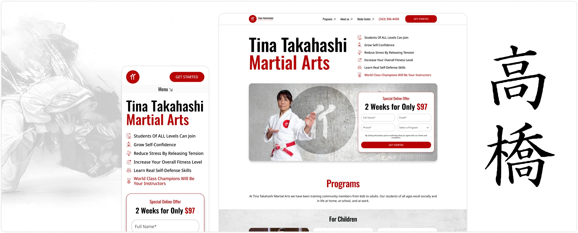
Tina Takahashi Martial Arts School is highly respected for its expert training in judo and other martial arts, led by world-class instructors. With a strong tradition rooted in Japanese martial arts, the school emphasizes excellence, discipline, and respect. 🥋 🎌🎌
However, the previous website struggled to convey the true value of its offerings. Many visitors didn’t fully understand why the pricing was higher than at other schools. Beyond price, the site failed to showcase what truly set Tina Takahashi apart—such as the exceptional qualifications of the instructors, the school’s rich history, and the personalized approach to training.
Additionally, the old website had an outdated design, poor navigation, and inconsistent presentation of information, which negatively impacted the user experience. Important details about the trainers and the benefits of the trial period were difficult to find, preventing potential students from fully appreciating the school’s value. 🧐
🔦 Highlighting Instructor Expertise:
To address the lack of information about the trainers, we created dedicated profile pages for each instructor, showcasing their credentials, achievements, and championship titles. This helps justify the premium pricing by demonstrating the world-class expertise of the trainers.
🗺️ Improving Navigation and Information Access:
The previous website’s poor navigation made it difficult for users to find key information. To solve this, we implemented a modern Bento-style layout that organizes content into clear thematic blocks. This makes it easier for users to access important details at a glance, such as class offerings, trainer profiles, and pricing.
🍥 Modernizing the Visual Design:
The old design felt outdated and did not reflect the professionalism of the school. I introduced a clean, modern aesthetic using Japanese-inspired elements, such as the Bento-style layout, to bring the website in line with the school’s roots. This modernized look helps convey the school’s prestige and makes it more appealing to potential students.
By addressing these core pain points, the redesigned website is now more user-friendly, informative, and visually aligned with the school’s reputation for excellence.
A key design decision for the Tina Takahashi website was to adopt a Bento-style layout. This approach, inspired by traditional Japanese Bento boxes 🍱, organizes content into clearly defined sections or “blocks,” each focused on a specific piece of information. This layout style was chosen for its simplicity, efficiency, and ability to guide the user through the site in a structured, intuitive way.

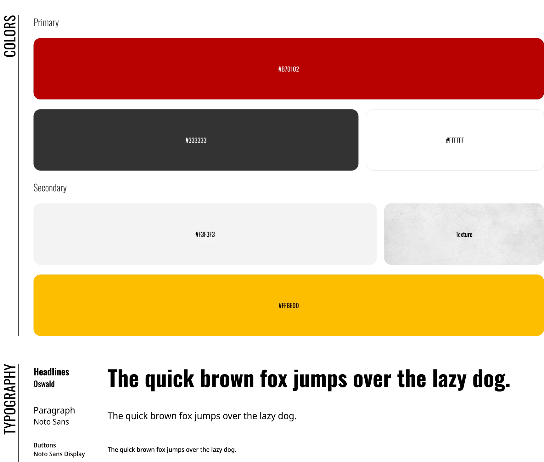
The visual identity of the Tina Takahashi website was carefully crafted to reflect both the prestige of the school and its strong connection to Japanese martial arts traditions. The UI design emphasizes clarity, structure, and a modern aesthetic, while staying true to the school’s heritage.
Typography:
Color Scheme:
The primary brand color is a deep red, #B70102, which represents power, energy, and tradition. Red is also culturally significant in Japanese aesthetics, often symbolizing strength and courage—perfect for a martial arts school.
Content Blocks and Visual Hierarchy:
The layout leverages a Bento-style approach, with content divided into clear, distinct blocks. To maintain clarity and hierarchy, the bold red is used for headlines and call-to-action elements, while grey separators guide the user’s eye through different sections without overwhelming them.
Consistency and User Experience:
The combination of Oswald and Noto Sans, along with the red, white, and grey color palette, creates a cohesive, polished look. This consistency reinforces the professionalism of the school and helps establish trust with potential students. The use of grey for certain blocks, along with the cement wall theme, adds subtle texture and contrast, making the content visually engaging without distracting from the key information.
By integrating these design choices, we were able to create a visually appealing, user-friendly interface that not only aligns with the school’s branding but also enhances the overall user experience.

The redesigned Tina Takahashi Martial Arts School website offers a modern, clean, and user-friendly interface that reflects both the prestige of the school and its deep martial arts heritage. By balancing bold, contemporary design elements with traditional Japanese aesthetics, the final look effectively communicates the value of the lessons and instructors.
The Tina Takahashi Martial Arts School website redesign has already begun to show positive outcomes, both in terms of user engagement and business impact.
Increased User Engagement: 💪
Improved Conversion Rates:
Positive Feedback:
Strengthened Brand Perception:
While it is still early to fully measure the long-term impact, initial results are promising, with better engagement, higher conversion rates, and stronger brand alignment. The new website has successfully positioned Tina Takahashi Martial Arts School as a premium choice for martial arts training, effectively communicating the value behind the higher subscription price.
P.S. The owner’s friend, who runs his own martial arts school, has seen the early success of the redesigned website (even in the early stages!) and is already interested in having me redesign his site too. I’d call that a win! 🥋🚀🎉