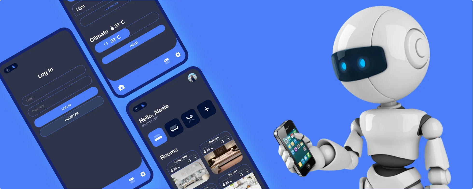
The project focused on redesigning and improving the user interface for a Smart Home app. The original app design was outdated, lacked user engagement, and did not fully convey the advanced features and functionalities of the smart home technology. The redesign aimed to create a visually appealing, intuitive, and interactive interface that accurately reflects the cutting-edge nature of the smart home solutions offered.
In the redesign of the Smart Home app, the primary challenge was its outdated interface, which was diminishing user engagement. My goal was to rejuvenate the app with a modern, visually attractive, and intuitive interface that would attract users and enhance their confidence in using the app. Additionally, I utilized user journey mapping to pinpoint crucial interaction moments within the app. This approach enabled me to uncover areas where the app could provide essential information and enhance the overall user experience, thereby streamlining the management and control of smart home devices in a more efficient and accessible manner.
In reimagining the content design for the Smart Home app, I employed wireframing to methodically organize the content into distinct, clear sections.
This strategy was directed at achieving two primary goals: firstly, to align with business objectives, which encompass motivating users to interact with key functionalities like controlling smart devices, scheduling routines, and accessing energy-saving tips; and secondly, to fulfill user expectations by delivering detailed and straightforward information on device integration, usage tips, and troubleshooting, as well as guidance on optimizing home automation for comfort and efficiency, thereby elevating their overall experience with the app.

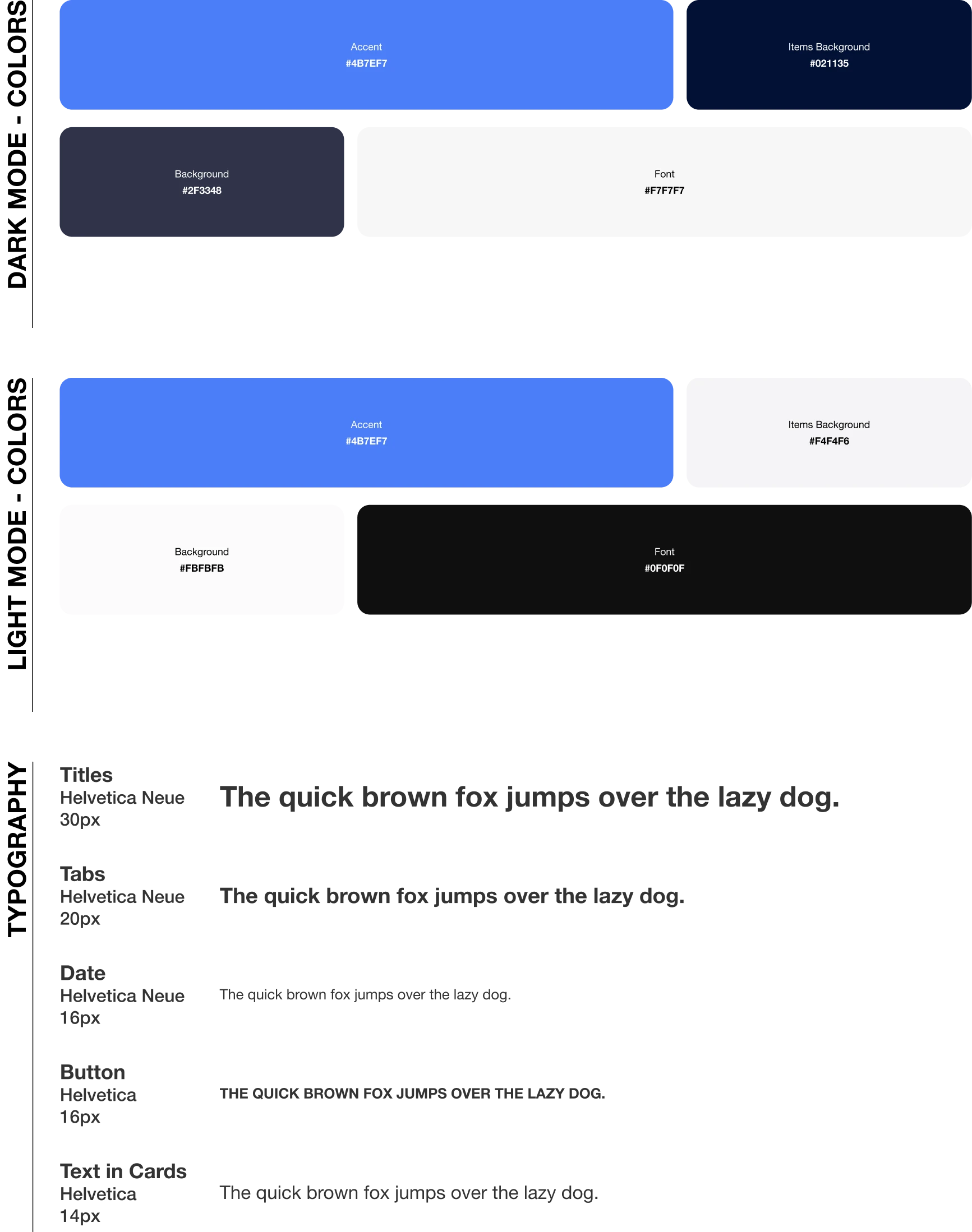
For the redesign of the Smart Home app, I implemented Helvetica Neue for titles and Helvetica for body text, adhering to a design principle that prioritizes clarity and a professional appearance. This typographical strategy is aimed at enhancing the app’s interface by ensuring that titles stand out with a modern and refined look, while the body text remains highly legible and approachable. The use of Helvetica Neue for titles introduces a touch of elegance and emphasis, guiding users’ attention to key sections and features effectively. Meanwhile, the classic Helvetica for body text maintains a clean and straightforward user experience, facilitating easy reading and navigation throughout the app. This careful selection of fonts supports the app’s goal to provide a seamless and user-friendly environment for controlling and automating smart home devices, reinforcing its identity as a leading solution in the smart home technology space.

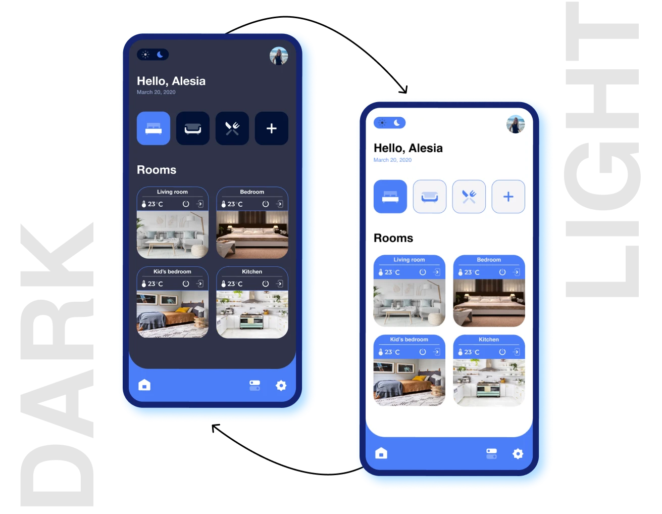
Here are the final designs for the webpages, after applying the visual identity.

Positive Feedback: After the launch, the landing page of Colorado’s Source for Distressed Property Information website received favorable feedback from users, indicating a boost in both engagement and user satisfaction.rnrnNext Steps: Going forward, the emphasis will be on consistently analyzing website analytics, soliciting ongoing user feedback, and applying regular updates and improvements. These initiatives will be informed by changing user needs and the latest trends in the real estate market, particularly in the distressed property sector, ensuring the website remains a valuable and relevant resource.rnrnu0026nbsp;
The Website Design project for the Source for Distressed Property Information effectively updated their online platform, turning it into a clean and accessible interface. This overhaul improved the site’s visual appeal and concentrated on boosting user engagement and satisfaction. By meticulously combining design elements with user-focused principles, the project created an online environment that not only highlights the potential of distressed properties but also aligns with the site’s business objectives and meets the refined needs of its audience.