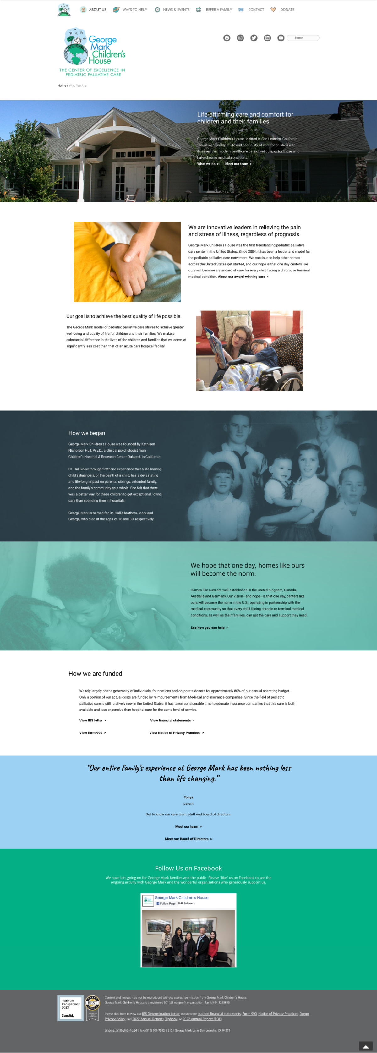
The project involved the redesign of the George Mark Children’s House website. The primary objective was to enhance the site’s visual appeal and user experience to better reflect the compassionate and supportive services offered by the organization. The previous website struggled with user engagement and did not effectively convey the warmth and dedication of the George Mark community. The redesign focused on creating an intuitive and welcoming online environment that aligns with the organization’s mission and supports families in need.
To effectively redesign the George Mark Children’s House website, I focused on identifying and addressing key pain points experienced by users. My strategy centered on enhancing the overall user experience by streamlining navigation, improving site responsiveness, and showcasing the organization’s mission and services.
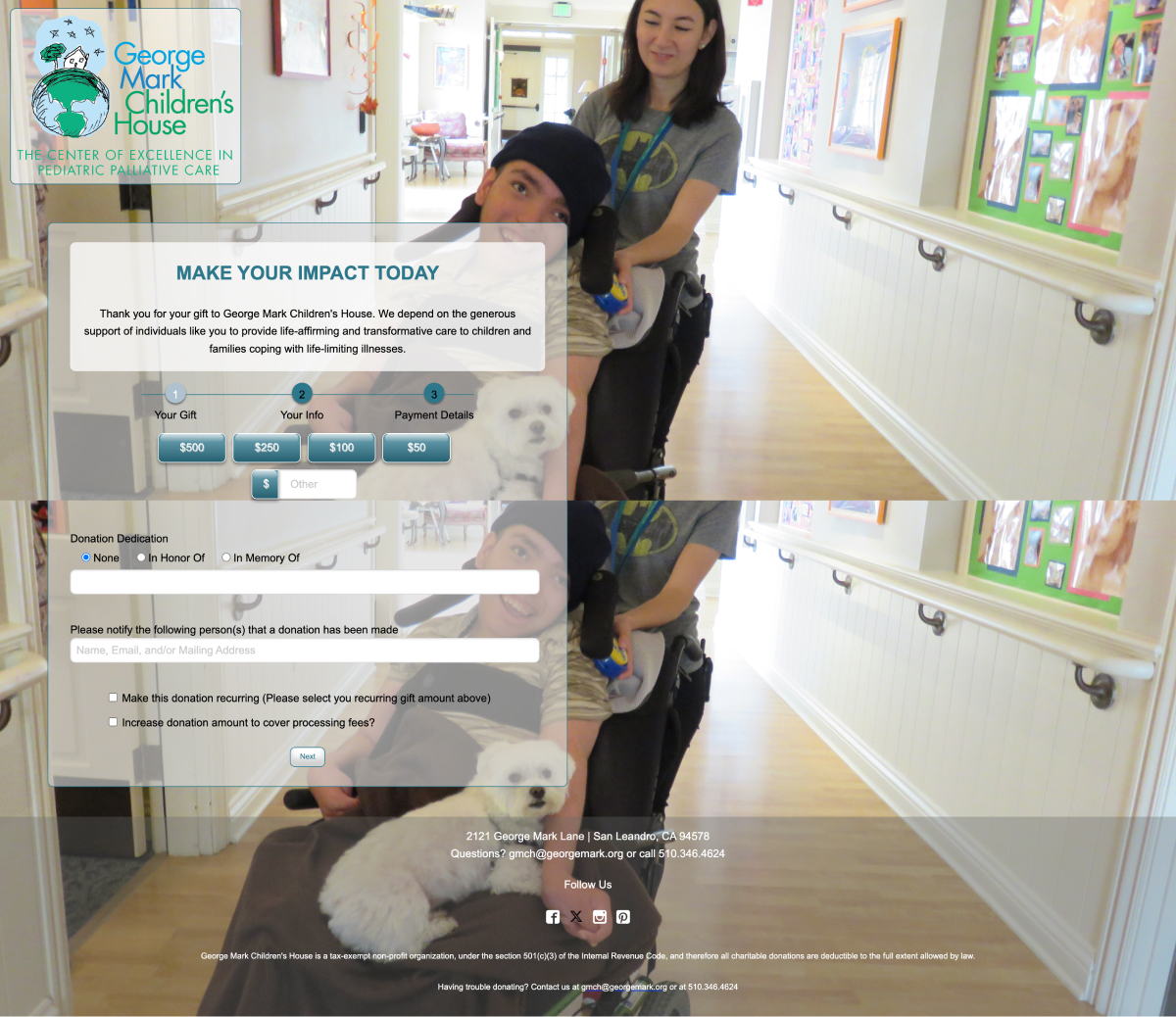
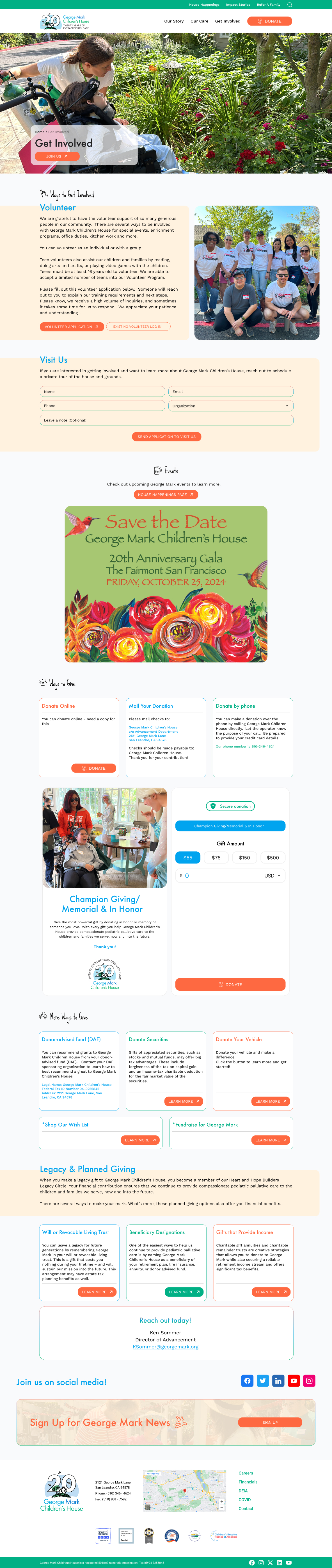
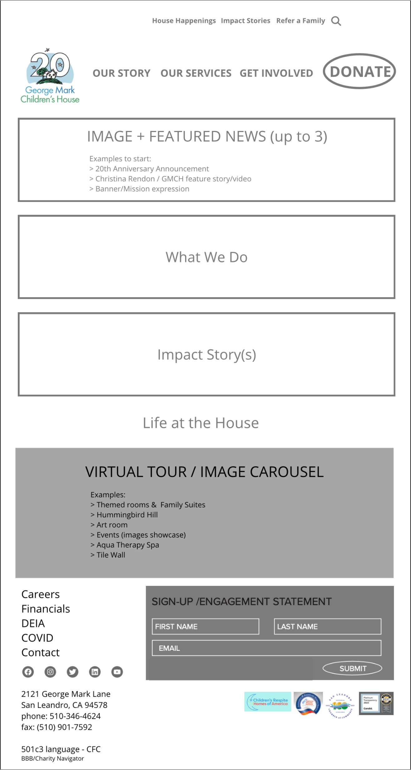
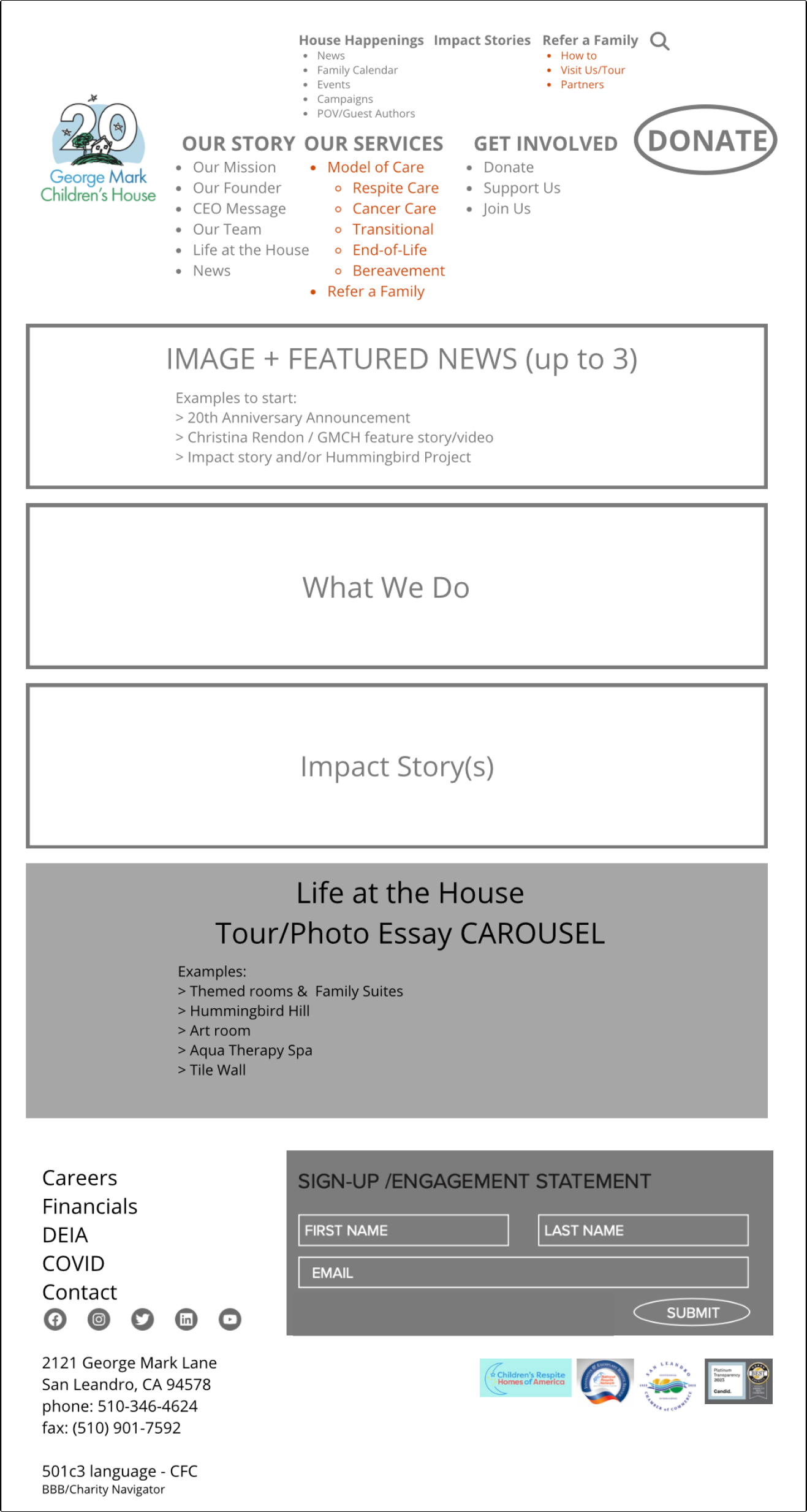
I implemented an intuitive design that guides users through the site, highlights detailed program information, and simplifies the donation process. A critical part of this strategy involved redesigning the site architecture to be more logically intuitive and easy to navigate. By analyzing user behavior and feedback, I identified areas where the previous structure fell short, leading to confusion and a disjointed user experience.
The new architecture simplifies navigation by logically grouping related content and features, aligning with user expectations and browsing habits. This reorganization allows users to effortlessly explore programs, access important information, and complete tasks with minimal friction. By addressing these pain points, I aimed to create a seamless, user-friendly experience that reflects the care and compassion of the George Mark community.

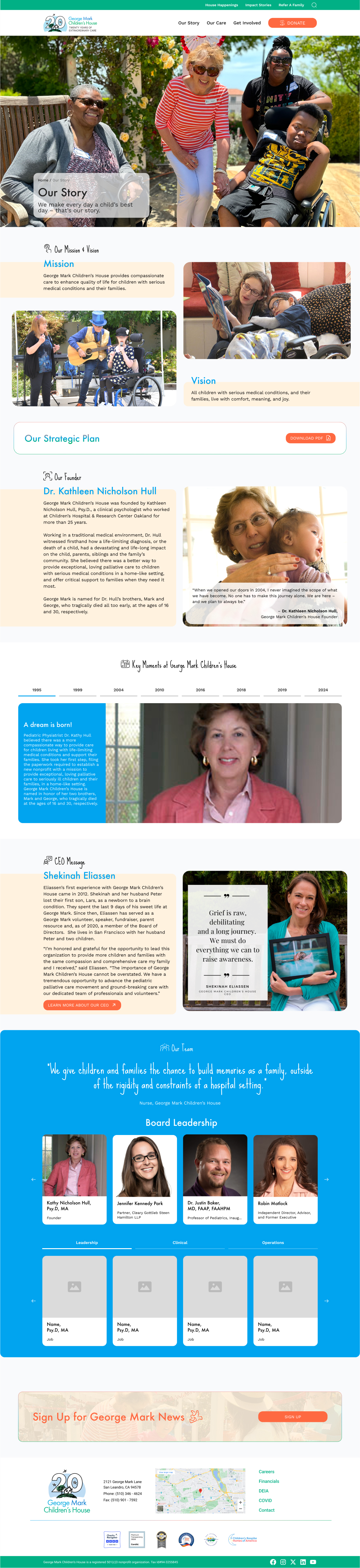
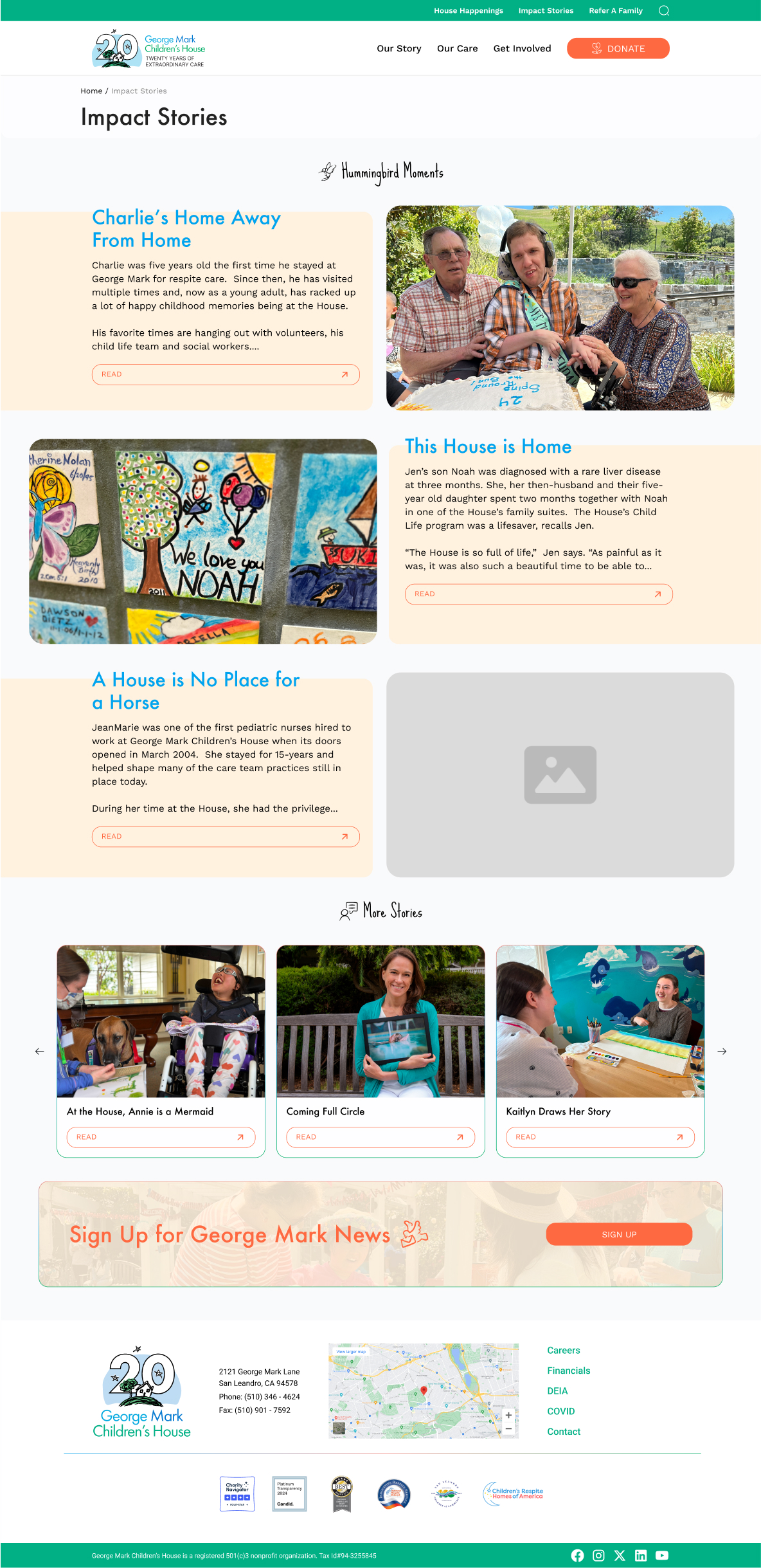
Laying out the content for the George Mark Children’s House website involved a strategic approach to ensure clarity, engagement, and effective communication of the organization’s mission. The goal was to present information in a way that resonates with users and highlights the compassionate care provided by GMCH.
Content Structure: I organized the website content into clear, logical sections that align with user browsing habits and needs. This involved creating dedicated pages for different programs, events, and ways to support George Mark. Each page was designed to provide relevant information without overwhelming the user, ensuring a seamless flow from one section to another.
Visual Hierarchy: To guide users’ attention and enhance readability, I implemented a visual hierarchy that prioritized key content elements. Headings, subheadings, and body text were styled to create a natural progression through the information. High-quality images and interactive elements were strategically placed to break up text and add visual interest.
Engaging Visuals: Given the importance of storytelling in conveying George Mark’s impact, I focused on integrating compelling visuals that capture the essence of their work. This included using high-resolution images of the facilities, detailed close-ups of activities, and stories that illustrate the transformative power of compassionate care.
Calls-to-Action: Clear and compelling calls-to-action (CTAs) were incorporated throughout the site to encourage user interaction and engagement. Whether guiding users to learn more about a program, make a donation, or attend an event, each CTA was designed to be intuitive and aligned with the user’s journey.
User-Centric Language: The content was crafted using user-centric language that speaks directly to the target audience’s needs and concerns. Emphasizing benefits such as care, support, and community involvement helped build trust and connect with potential supporters on a personal level.

For the George Mark Children’s House website redesign, I carefully selected a combination of fonts to create a warm and inviting atmosphere that aligns with the organization’s mission of compassion and care.
The colors not only make the site visually appealing but also convey a message of hope and positivity, aligning with the organization’s mission to support children and families through challenging times.

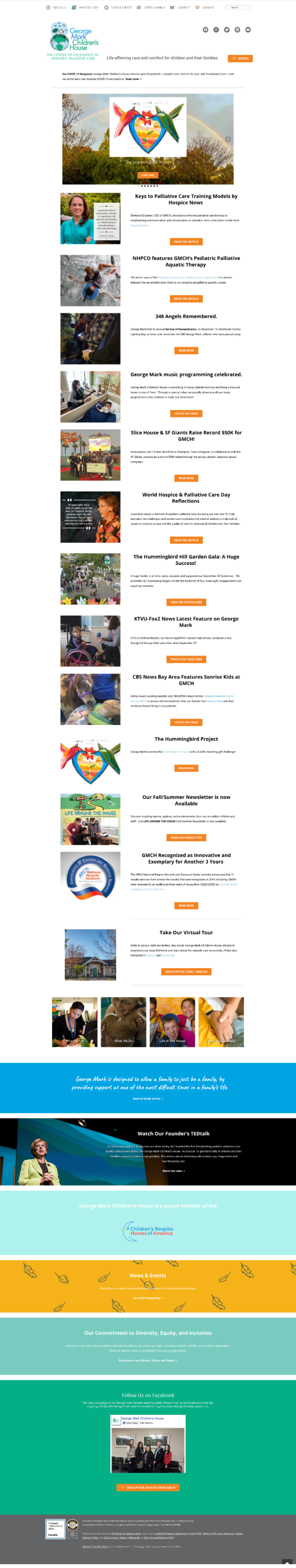
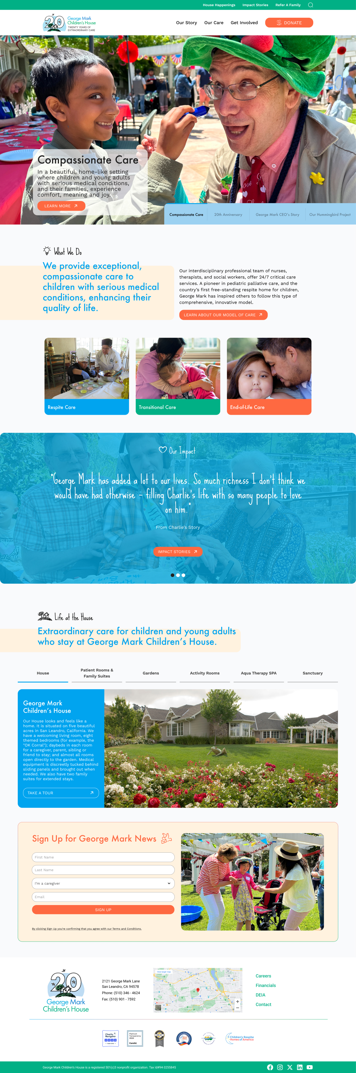
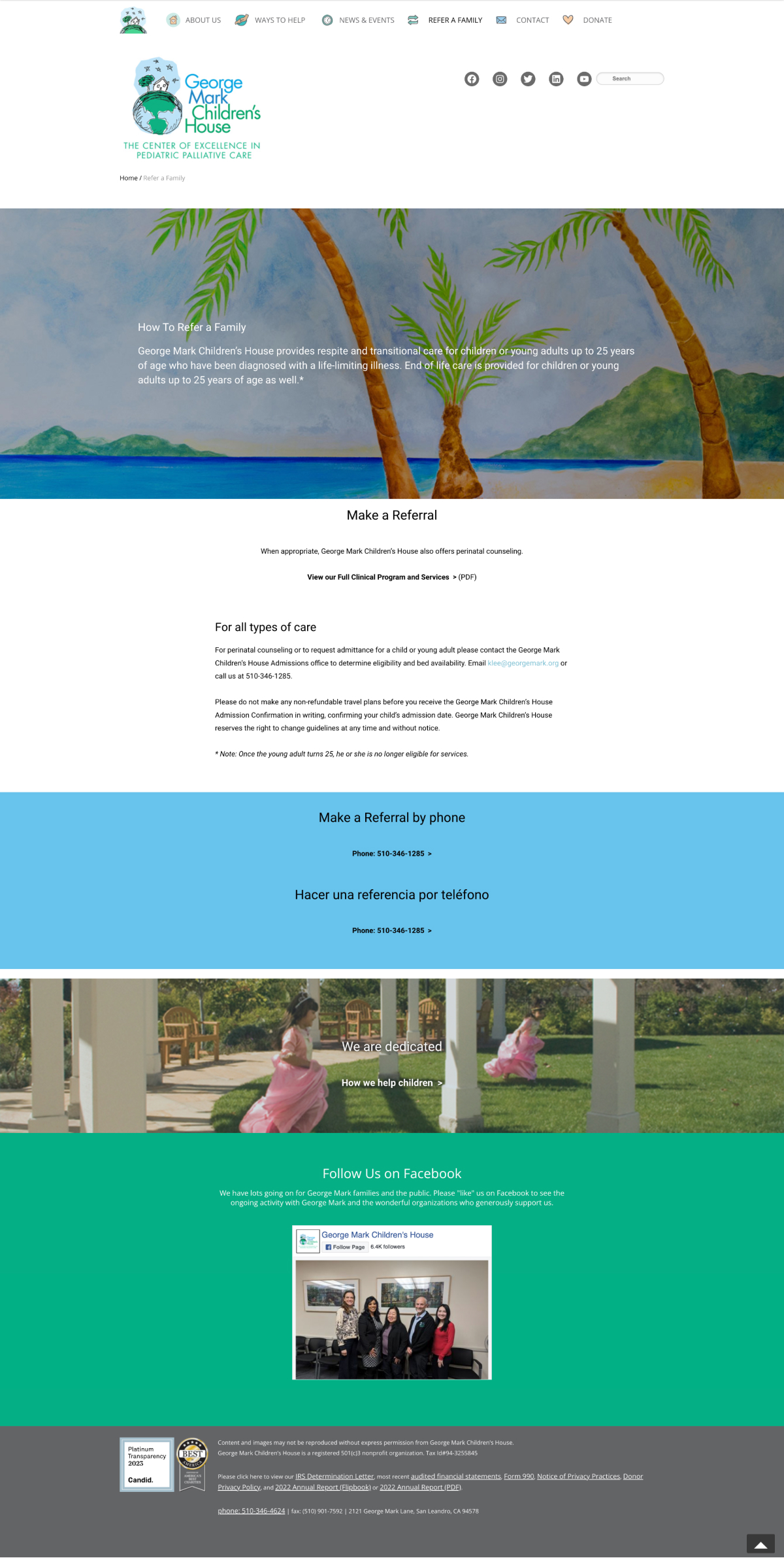
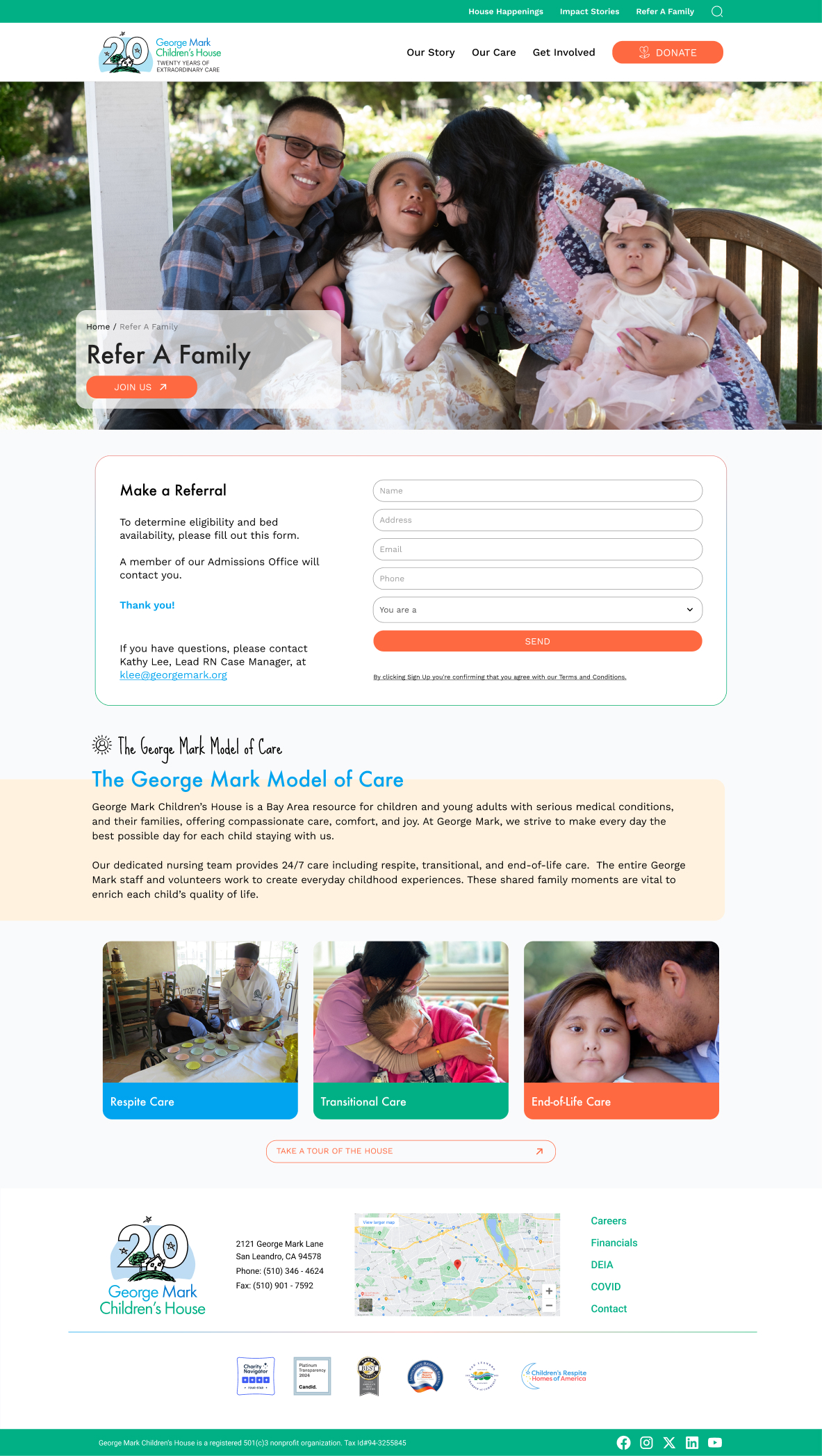
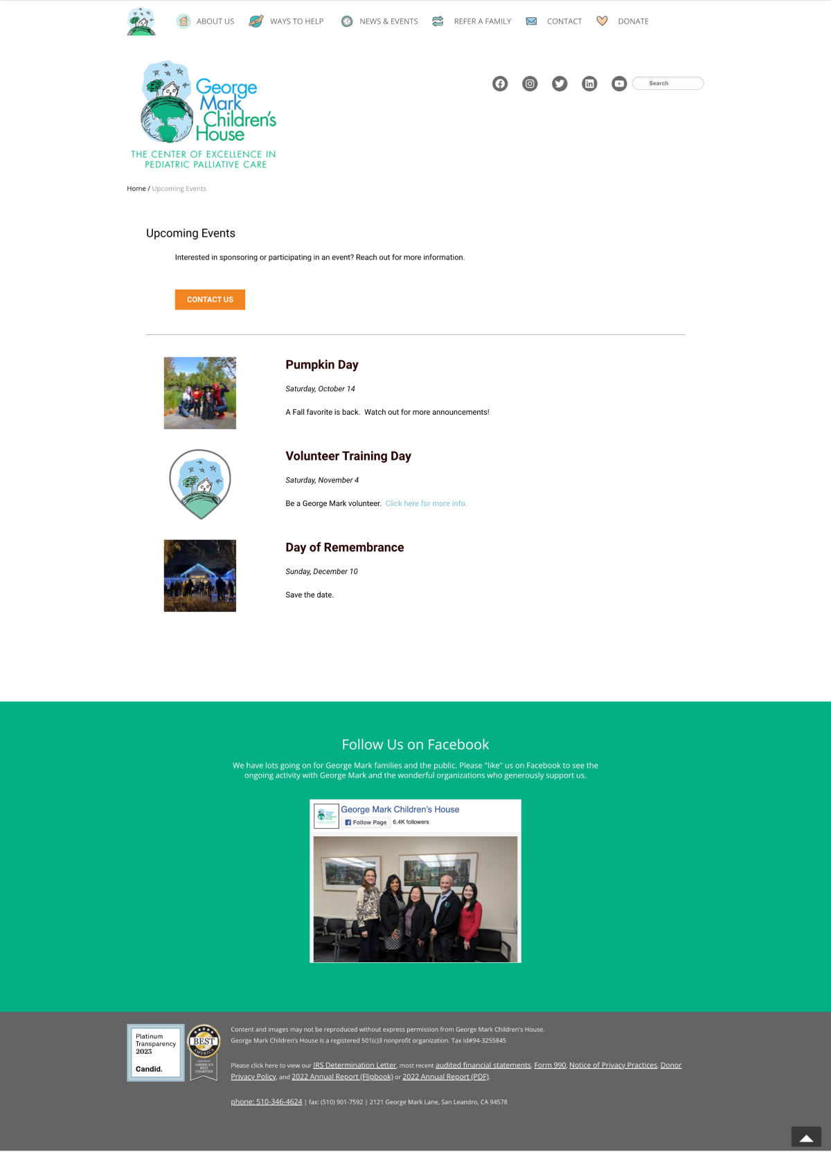
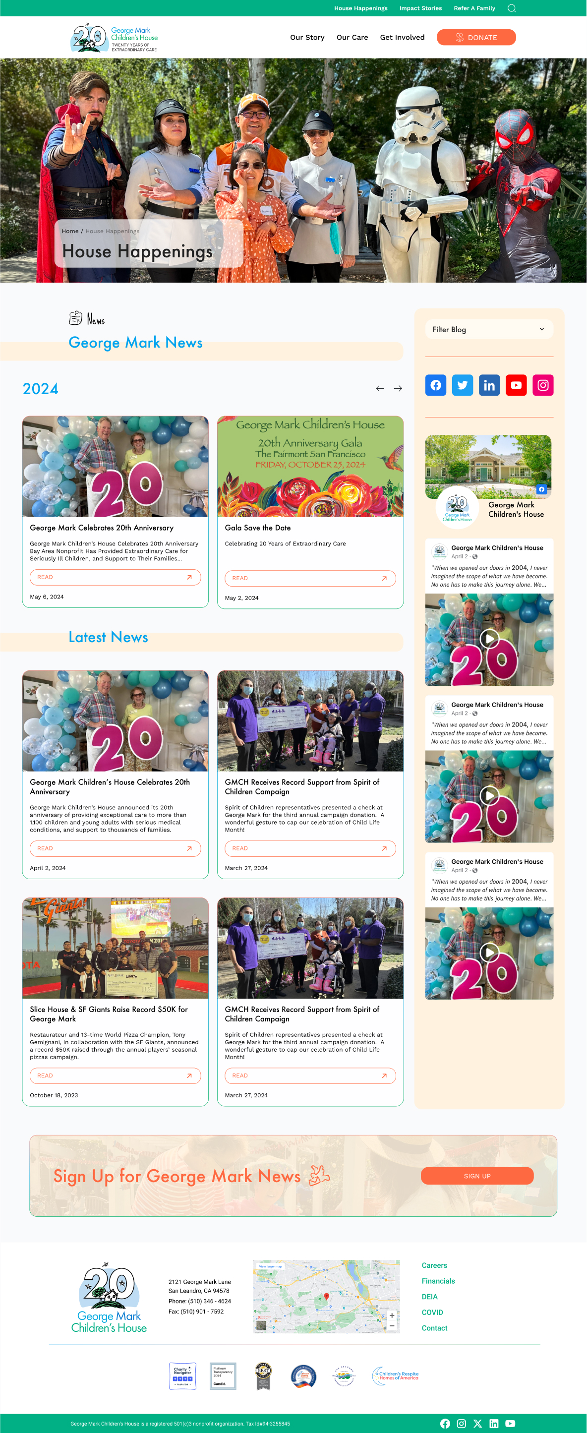
Here are the final designs for the George Mark Children’s House website, showcasing the successful application of the organization’s visual identity.
The redesigned George Mark Children’s House website has achieved outstanding results, significantly enhancing the organization’s online presence and user engagement. Here are some of the key outcomes:
Increased User Engagement: The new design has led to a noticeable increase in user interaction, with visitors spending more time exploring the website and its offerings.
Improved Brand Perception: The updated visual identity and professional design have reinforced George Mark’s reputation as a leader in children’s care, attracting a broader audience and instilling confidence in potential supporters.
Positive Client Feedback: The feedback from families and supporters has been overwhelmingly positive, praising the website’s aesthetic appeal and ease of use. Many have commented on how the site now truly reflects the care and compassion they expect from George Mark. Additionally, the vibrant color palette was designed to resonate with children and families, using bright and cheerful colors to symbolize life, joy, and resilience, emphasizing that happiness can be found in any situation.
![]()
![]()
![]()
![]()